Mutual Funds Clustering Analysis
This study is part of a larger project analyzing the performance of investors' RRSP accounts.
The interactive plot on this page does not support mobile devices.
Background: Most RRSP account investments are in mutual funds. While developing a statistical model for mutual funds returns, I observed that different funds behave significantly differently. As a result, a single model for all mutual funds is likely inadequate. I determined that additional information on these funds was necessary. All subsequent steps were performed in Python.
-
The first step involved scraping additional information from various sources. Specifically, I scraped data on:
- Mutual funds holdings: A sample page for scraping can be found here. I focused on the asset, sector, and geographic allocations displayed in the three pie charts.
- Historical prices: I scraped historical prices for the past 20 years, or since the fund's inception.
symbol name category inception objective asset_allocation sector_allocation geo_allocation AGF1416 AGF Fixed Income Plus Class Series W (Canadian Fixed Income) (4/27/2016) The Fund's investment objective is to provide steady income to investors by investing primarily in fixed-income securities. ['Cash and Equivalents: 6.05%', 'Other: 1.38%', 'Canadian Corporate Bonds: 44.91%', 'Canadian Government Bonds: 28.57%', 'Foreign Corporate Bonds: 9.62%', 'Foreign Government Bonds: 9.47%'] ['Financial Services: 0.23%', 'Fixed Income: 92.72%', 'Consumer Goods: 0.32%', 'Healthcare: 0.24%', 'Other: 0.44%', 'Cash and Cash Equivalent: 6.05%'] ['Europe: 0.5%', 'Other: -0.05%', 'North America: 99.79%', 'Multi-National: -0.37%', 'Asia: 0.1%', 'Latin America: 0.03%'] - Next, I verified and cleaned the data, then transformed the historical prices into features for clustering analysis. These features include returns, volatility, skewness, correlation with the S&P 500, correlation with interest rates, and more. Note that none of these features are derived using mutual funds holdings information.
- Visualization and exploratory data analysis: I applied t-SNE to reduce the dimensionality of the data for visualization and performed a KNN clustering analysis using the engineered features. The interactive visualization below shows different clusters in different colours. Move the mouse on the scatter plot to view the holdings information for mutual funds within the red rectangle, and use the slider to adjust the size of the rectangle.
-
We observe that mutual funds with similar holdings tend to cluster together in the scatter plot, and smaller clusters of highly similar funds are identifiable, such as the ones in the following figure.
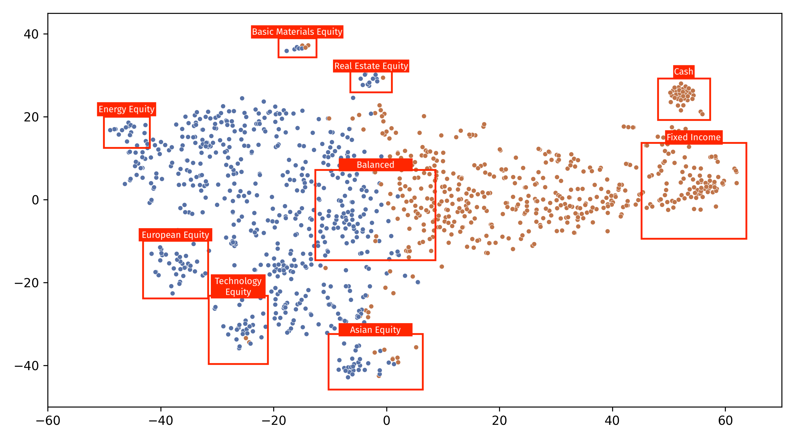 It appears that the horizontal axis roughly represents asset allocation. Although sector and geographic allocations also influence mutual fund performance, they require further in-depth study. Moreover, the clustering analysis per se is not satisfactory as it does not yield clearly defined clusters, which is understandable since mutual funds often contain a mix of equity and fixed-income investments. This places them along a spectrum rather than in an equity/fixed income dichotomy.
Based on the analysis, I concluded that it is essential to consider at least the asset allocation of each mutual fund. In light of these findings, I proceeded to explore mixture models for mutual funds modeling.